
Duration: 2 months
Role: UX Designer, UI Designer
Tools: Sketch, Balsamiq, InVision, Marvel, Flinto, Pen & Paper
Design a responsive web app that facilitates property buyers without experience in the real estate market to find the best properties according to their interests.
Starting with a Project Brief and some already elaborated user research, I should fill the UX gaps and fully develop the UI Design in a real project simulation in the context of my certification with CareerFoundry.
I would have 2 months to reach a polished design.
I would apply the Design Thinking Process, with a Mobile-First approach.

Understand-Observe-POV: analyzing the provided information and filling possible gaps (Definition of the Problem Statement, Competitor Analysis, User Persona, User Stories).
Ideate: Task analysis & User flows.
Prototype & Test: creating first sketches and wireframes, and iterating through them with a quick Usability Test.
Moodboard: defining the visual direction.
Polished mobile mockups: mobile-first approach.
Style Guide: defining the brand.
Interactive prototype: making the design alive.
Animations: a step beyond the interaction design.
Responsive design: making the design grow for different breakpoints.
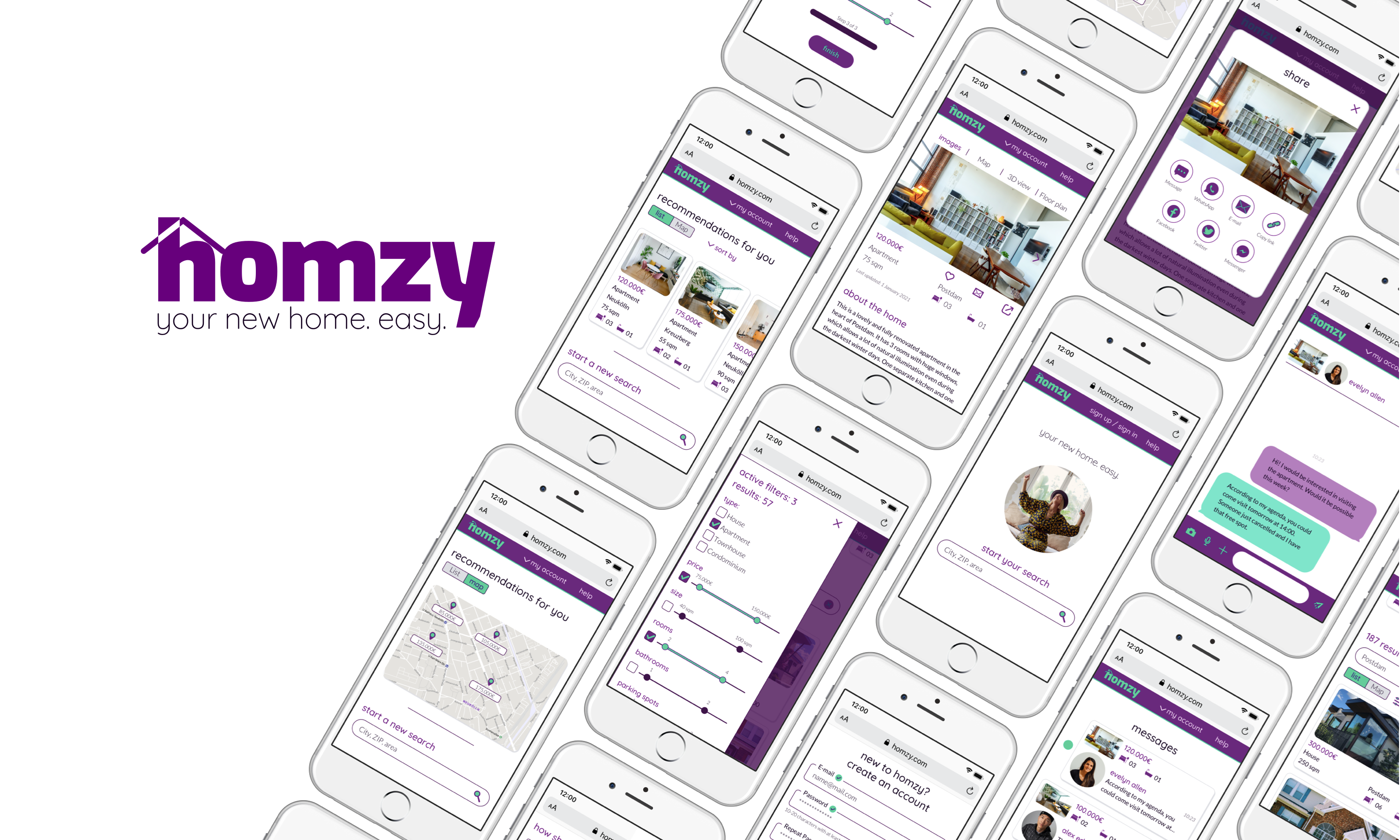
A fully usable prototype with a polished and documented UI for a responsive web app that helps inexperienced users in the field to find the perfect property that matches their needs. On top of that, a design of how the web app would adapt in a responsive way to different screen sizes.
Most of the User Research had already been executed and filtered. This helped me condensate all the initial steps of the Design Thinking Process. But it created a new challenge: I should interiorize and make mine all the insights, while filling the gaps in the provided information to ensure the best results from a user’s perspective.
I had in my hands a project brief, feature requirements, a User Persona and User Stories, and partial brand guidelines.
I needed to concrete all that in a specific Problem Statement, to know exactly where I should go:
Rashida needs a way to access autonomously a comprehensive and customized list of properties on sale, because she is new to the market and doesn't want to spent time struggling with uncomprehensive information of properties out of her range of interest.
I already knew the business requirements and the user needs. But I was still missing something: why create something new when there were so many products out there in the real estate business? I needed to execute some Competitor Analyses.
I got some relevant insights:
Too much detailed information in a first approach is overwhelming for newbies.
A relaxed design that does not recall luxury and includes images of people gives a more human approach.
A modern design with interactive and visual elements, like sliders for the options, helps to make the product more user-friendly.
I gathered general ideas about the best content, features, and filtering options.